
Visualizing Cognitive Data
How I designed complex cognitive data visualizations to maximize data comprehension and minimize data analysis time.
Role
Product Designer
Duration
12 weeks
Platform
Web
The Challenge
Our dashboard dashboard is providing cognitive data to users who have never seen this new kind of data tracking.

No existing mental models
Users typically rely on prior experience when interpreting data. With novel data, there are no reference points to understanding what it means.

Cognitive overload
Complex visualizations will overwhelm users instead of helping them.

So many possibilities
There is so much knowledge to obtain from cognitive data so I need to narrow down the amount of info given to users.

Low adoption
When the data given to users isn’t helpful, they are less likely to keep up data collection.
The Process
A collaborative and systematic approach combining user research, competitor research, and iterative design.
Learning the Data
Discussed data possibilities with our Data Operations team to gain an understanding of the data we can provide, what is the most interesting to users, and how to explain the data to users.
Data Visualization Research
I researched different types of graphs to compare visualizations and get feedback on what is the most comprehensive way to display information for users.
Iterative Design
I worked on designs and consulted with the Chief Product Officer, a Data Engineer, and coworkers for feedback until we were happy with the solution.
User Interviews
-
![]()
Potential User
“As a coach, it would be helpful for me to track my players’ cognitive abilities so I know when I can push them vs. rest them.”
-
![]()
Potential User
“I’d like to see data for my team overall and also view players individually… It would also be great to see data over multiple time periods like day, week, month.”
-
![]()
Potential User
“I want to be able to see only my own data. I want to be able to see when I can push myself vs when I need a break.”


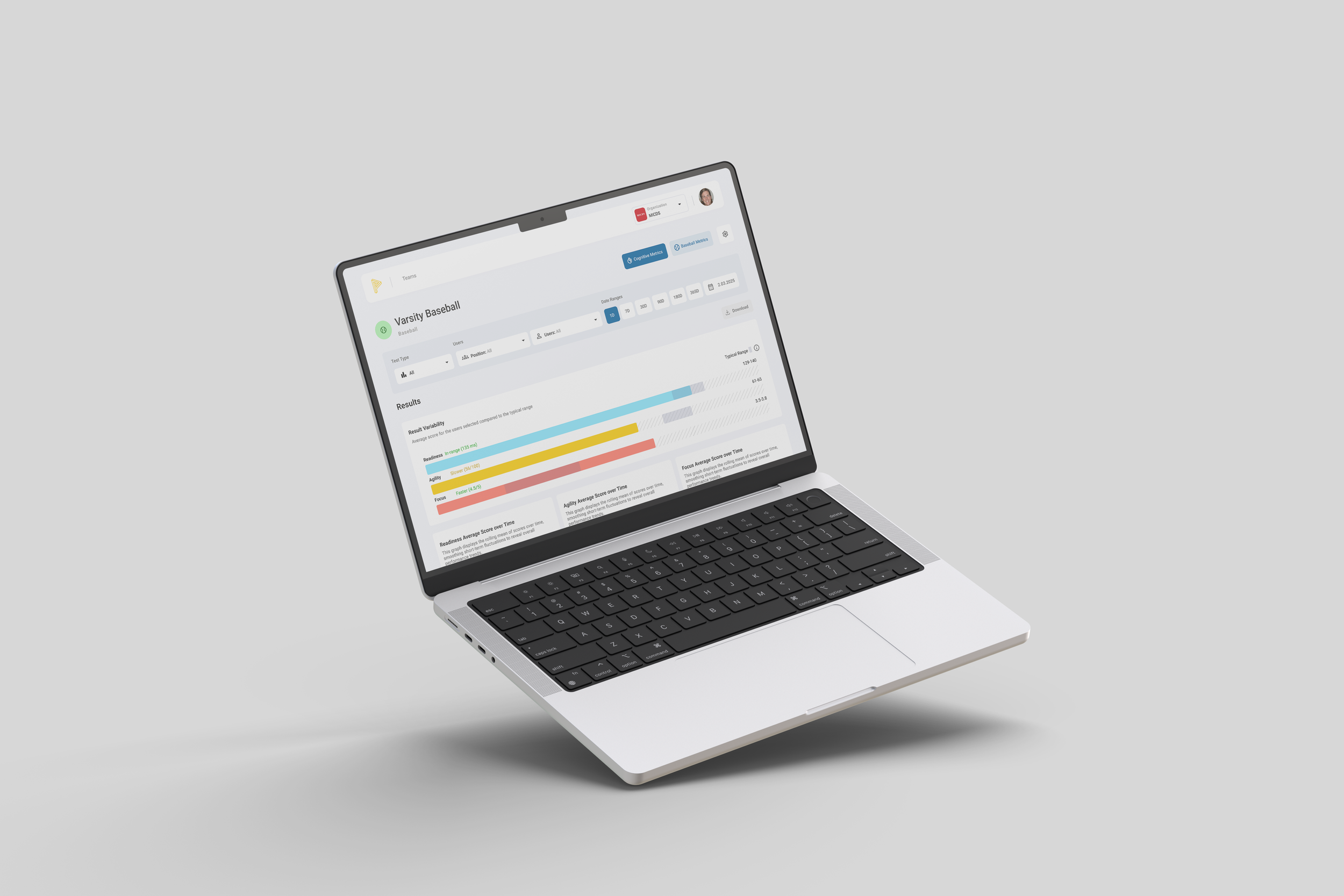
The Solution
I focused on creating recognizable graphs and displaying consistent information across the three cognitive tests from which we collect data.
Reflection
A key design challenge in this project was producing data visualizations for data users have never seen. Without established patterns to lean on, the interface needed to be highly intuitive, offering clear visual hierarchy, contextual cues, and tooltips to help users interpret unfamiliar information with confidence.